)
)
Colour coordination for contrasting interiors
Joe Simpson takes a look at the rich and fascinating subject of colour, with advice on how to create looks your clients love.
Interior design blogs and specialist magazines love to pigeon hole today’s interior trends into neatly wrapped packages. Don’t get me wrong, I am as guilty as anyone of labelling specific interiors as cottagecore, Scandi, industrial, Boho, shabby chic, Mid Century Modern and castlecore.
But all these interior concepts – both minimalist and maximalist – should be underpinned by a considered approach to colour. For instance, matching ceramic tiles with paint and wallpaper requires balancing tones and proportions to keep spaces harmonious. It is important to choose plain or neutral paint to let bold patterned tiles shine, or pick a wall colour that is one to two shades lighter than the ceramic tile’s primary palette.
One of the most important developments in the ceramic tile sector in recent years has been the emergence of whole product portfolios from individual manufacturers – spanning stone looks, wood effects, plain colours, marbles, cottos – all with precision matched undertones. These can be warm (beiges, yellows) or cool (greys, blues). These coordinated range really help the design process. In fact success is almost guaranteed if the ceramic tiles, paint/ and/or wallpaper share the same undertone. This allows the finished room to flow naturally.
Balancing the elementsWhen making a more dramatic statement, try to balance the busy elements. For instance, pair vibrant, patterned wallpapers with simple, neutral floor tiles. If your client plans to use tiled splashbacks that are highly decorative, it is a good idea to suggest that these are set beside plain paint.
It is often a good idea to play with contrast, such as pairing dark ceramic tiles with deep, moody paints create a cozy, cocoon-like effect. This works particularly well in the blue colour space, such as pairing Midnight Blue tiles with rich navy paint.
Many premium UK design houses offer perfectly colour-matched elements. These can be a great suggestion for clients, or can be used as a stopping-off point in the design process. For instance, Little Green offers authentic paint collections that perfectly complement tile collaborations. Or you could check out the synergies between well-established high street names such as Topps Tiles and Dulux.
Achieving a successful maximalist look with tiles, paint, and wallpaper involves confidently clashing patterns, mixing contrasting textures, and using vibrant, saturated colours. The key to pulling this off without it looking chaotic, anchor these daring choices with common base hues and physically separate patterns with distinct design transitions.
To make clashing patterns work, ensure all elements share at least one underlying colour. If the wallpaper features a vibrant jungle print with hits of emerald green, pair it with a rich, glossy emerald for an harmonious colour connection.
When combining vibrant decorative wallpaper and patterned or highly coloured tiles, advise your client to separate them with a painted dado rail or moulding strip, rather than letting them butt directly against each other. In both bathrooms and kitchens, it is often a good idea to use tiles on the lower half of the wall and wallpaper on the upper half, with a moulding border.

In today’s interior world, colour is often a partner for texture and surface finish. Maximalism often relies heavily on textural contrast. Pair matte, chalky-finish paint with highly reflective, gloss glazed tiles. This interplay of light prevents dense, busy walls from looking flat.
To create energetic, but still coordinated, spaces, use complementary colours. These are tones opposite each other on the colour wheel. A great example is pairing on-trend warm terracotta or pink-toned tiles, with a deep, dramatic green wallpaper, maybe with a botanical design.
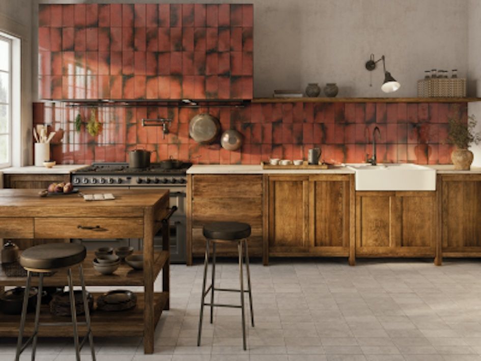
If the look your client is after is more organic and nostalgic, perhaps referencing the cottagecore aesthetic, you should advise leaning into warm, rustic textures, and vintage accessories. Clients should anchor spaces with natural materials and balance highly detailed, folksy patterns with simpler, earth-toned elements. Hand-painted botanical, bird, or rural motifs on off-white or cream should be used sparingly as a backsplash or focal point. Pair these with terracotta or travertine-effect tiles. These have warm earthy tones that bring natural warmth, and will pair well with crackle-glazed subway tiles or encaustic effects with a North African vibe.
Perhaps the key to success in this design space is contrast. If the floor tile is bold, and decorative, such as a Victorian-inspired patterned tile, set it against simple gloss or matte cream wall tiles.
If you client wants to push the boundary and explore the castlecore look, it is a great idea to suggest a few boundaries. To prevent the theme from becoming overwhelming, suggest covering no more than 60% of the wall or floor in a dominant tile: such as a dark charcoal slate-effect on the floor. Contrast this with around 30% in a secondary tile, which should be lighter, and maybe more intricate. Then the client can go wild with accent tile over the remaining 10% of the space, such as a bright metallic mosaic lining for a bathroom niche, or a shimmering onyx splashback in the kitchen.
Matching tiles to cluttercore – a highly personal, maximalist, and eclectic design style that celebrates collections and objects – means treating your floors and walls as a textured canvas. The key is balance: let your tiles provide a cohesive, grounding foundation so your vibrant, layered décor remains visually exciting rather than visually exhausting.
The key discipline to stop a maximalist space from becoming visually chaotic, is to tie the tiles to a central colour palette. One way to get your clients on side is to get them to pull a secondary or tertiary colour from a favourite rug, art print, or vase, and match it to the tiles.
Pair bold, intricate patterns on the floor with solid, single-hued tiles on the walls to give the eye a place to rest. Use contrasting or unifying trim pieces (such as a marble listello or brass strip) to border specific areas and prevent them from spilling into one another.

You can even advise using grout as a design element. Matching grout to a subtle colour in a patterned tile can help to anchor the design and make it part of the room’s overarching narrative.
When the desired destination is a more minimalist aesthetic, prioritise monochromatic schemes, low-contrast grout, and uniform textures. Stick to earthy neutrals (soft whites, bone, greys, beiges, and greige) using large format, matte-finish tiles. Minimise visual clutter by carrying the same material from floor to wall, or by using vertical, stacked tile layouts.
XXL porcelain or stone-effect tiles require fewer grout lines, creating a sleek, uncluttered canvas that makes spaces feel open. For the minimalist look, your client should opt for a matte or honed finish over a glossy one. This will diffuse light gently and help maintain a calm, tranquil atmosphere.
Another great suggestion you can make to clients is to choose grout that is an exact colour-match to the tile. This allows the joints to virtually disappear, emphasising the clean lines.
There are different minimalist colour palettes. For a warm minimalist look, your clients should layer soft beiges, taupes, and warm whites. This prevents a room from feeling too stark or clinical. It also pairs perfectly with natural wood.
For a cooler, more masculine, look, your client should feature cool-toned neutrals like soft greys or slate-effects. These work exceptionally well in modern, industrial-chic spaces. Here the contrasts are monochrome, such as pairing dark grey or charcoal floor tiles with lighter, off-white wall tiles.
For the ultimate minimalist look – ideal for a bathroom upgrade – suggest using the same tile for both the floor and shower/accent walls to create seamless continuity. This monolithic aesthetic can be really impressive, even in a small space. To add visual depth without compromising the minimalist aesthetic, suggest lightly textured stone-effect or concrete-effect tiles rather than bold, decorative patterns.
The best piece of advice you can give to your client is be brave and be bold. They should not fear pattern, colour, or texture, but use them thoughtfully to achieve the best results. These simple hints will help to make your next decoration project, whether it features ceramic tiles, wallpaper, paint, or another finish, something to be remember with pride.